Gotico-Antiqua, Proto-Roman, Hybrid.
15th century types between gothic and roman.
Atelier national de recherche typographique
École nationale supérieure d’art et de design de Nancy
Symposium 25 & 26 April 2019
Exhibition 25 April – 17 May 2019
The most important change in typography occurred in the fifteenth century. […] It is unbelievable for me, that in the same century, in a very short period of time, an evolution arose from strict gothic to modern roman type. It always remained a mystery to me. Adrian Frutiger, in Ein Leben, film by Sebastian Rohner, 2011.
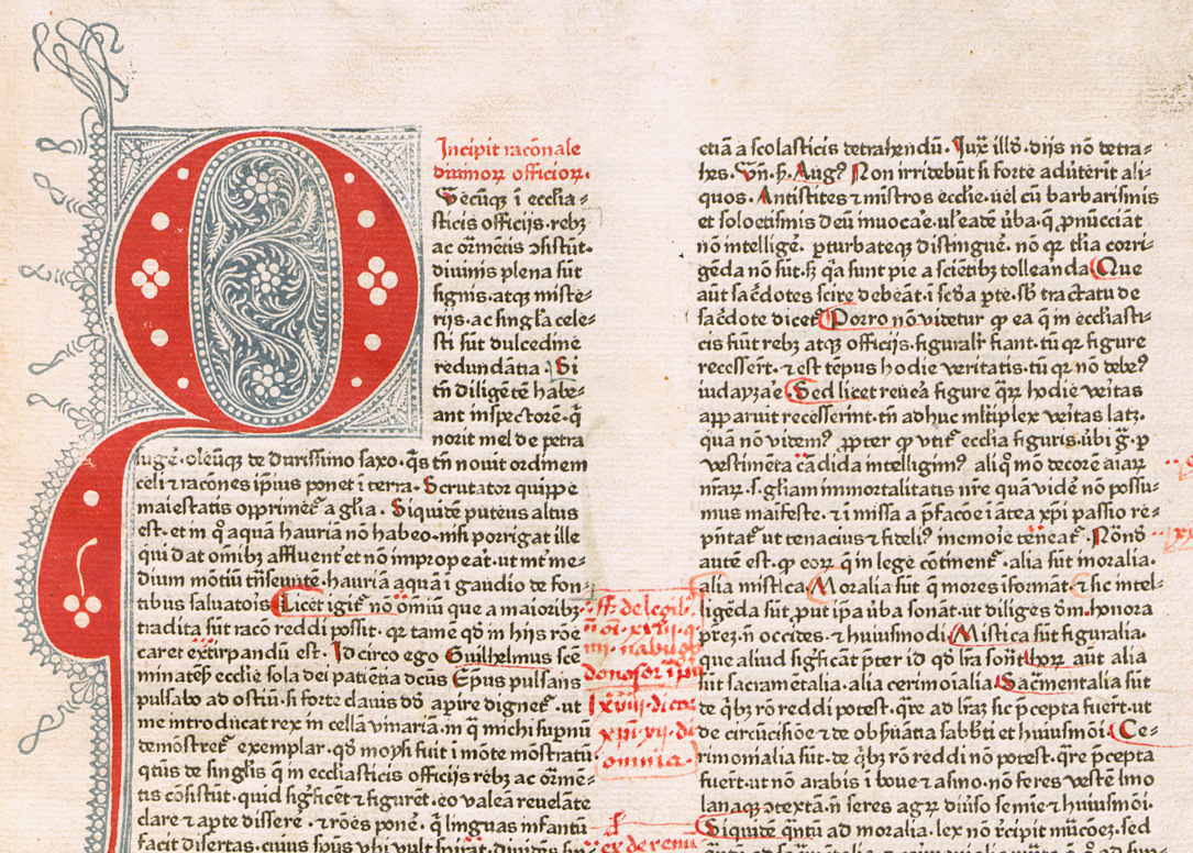
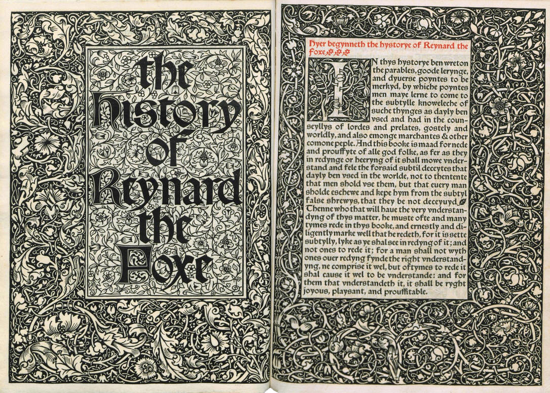
The two-day symposium and the exhibition Gotico-Antiqua, Proto-Roman, Hybrid. 15th century types between gothic and roman are based on a current research programme at Atelier national de recherche typographique (ANRT), which investigates the period 1459-1482. The symposium aims to bring together researchers from the fields of typography, palaeography and incunabula studies, with a particular focus on type and letterforms. This relatively understudied period – after Gutenberg and before the consolidation of Jenson’s model – extends from the earliest traces of ‘humanistic’ tendencies to ‘pure’ roman, including many cases of uncertain or experimental design, voluntary hybridisation and proto- or archaic roman. In 1459 in Mainz, Johann Fust and Peter Schöffer printed the Rationale Divinorum Officiorum by Guillaume Durand, using a typeface (now known as ‘Durandus’) that looked like no other before. From that point, we can follow a wide variety of developments, partly related to the travels of early printers from the Rhine area to Italy and France. By extension, we are also interested in the Private Press movement initiated by William Morris and Emery Walker at the end of the nineteenth century in England, which revived some of those typefaces before they were once more largely forgotten.
13:00 – 14:30
Vincent Lacombe
Textura calligraphy
This workshop will allow the participants to discover Textura writing through a calligraphic approach. Appeared in the 13th century, it is the result of a long evolution of gothic scripts. It is the one Gutenberg will use to print the B42 Bible. After a short historical introduction, the calligraphic ductus of Textura will be approached, as part of exercises and/or custom applications. No no prior knowledge is required. Calligraphic material will be lended to the participants, which can bring as well their own (minimum width 3 mm).
Learn how to discover, identify, write and master the Textura style.
Where ANRT, 15 participants max.
13:00 – 14:30
Alexis Faudot & Rafael Ribas
V1.? how to make your own Gotico-Antiqua, Proto-Roman or Hybrid
This workshop will be about knowing how to approach a 15th century type-print, the limits of accuracy, and be able, at wish, to take the path of interpretation with a maximal understanding of the original forms. Every participant will be invited to draw his own version, accurate or not, of a common source chose in the corpus of revived types produced by Alexis Faudot and Rafael Ribas during their corpus of revivals. This workshop is mainly directed towards type or graphic designers, but no prior knowledge is required. Bring your laptop and a type design software of your choice.
Learn how to find and get your Open-Source typeface file, get an overview of the analyzing process of a glyph source, draw with vectors from incunabula sources, modify and transform an existing type, create multiple masters, interpolate, export and test your font in current design softwares.
Where ANRT, 15 participants max. Full
17:00 – 18:30
Ferdinand Ulrich
Fanfare letterpress
This workshop allows participants to print type specimens from original Fanfare letters made in wood, metal and Plakadur (Berthold’s own plastic resin letters). Together we will explore the typographic system and you will learn how to arrange letters on the press, how to prepare and lock up a printable forme, and learn about the basic printing process. At the end of the workshop you will have experienced typesetting, leading, spacing (no kerning!), and printing. All the type is provided by p98a, a post-digital letterpress studio in Berlin. The instructor’s talk about ‘Fanfare, the expressive blackletter Grotesk from Berlin’ will tell you everything you need to know about the typeface. Experience in letterpress printing is very welcome, but not necessary. Aprons should be provided by the university, however, don’t dress in white and certainly do not wear your Sunday best; you will get your hands dirty.
Learn how to arrange and set type on a press, prepare a printable forme, print on a proof press.
Where ENSAD’s letterpress workshop, 6 participants max. Full
Exhibition
The eponymous exhibition curated by Jérôme Knebusch is located next door to the symposium. It presents the historical context of 1459–1482 with original incunabula, revivals from the private press mouvement 1891–1929 and showcases unique enlargements of letterforms and complete alphabets which were specifically re-designed for this event. The exhibition also marks the end of the research programme, directed since 2016 by Jérôme Knebusch at ANRT. It opens its doors on 25 April 2019 at 18:00, right after the first conference day. The exhibition is visible until 17 May 2019, Monday–Friday 2–7pm. Closed 1st and 8 May. Free entry
Artists Johann Fust & Peter Schöffer, Johann Mentelin, Johannes Gutenberg, Konrad Sweynheim & Arnold Pannartz, Ulrich Han & Sixtus Riessinger, Johannes & Vindelinus de Spira, Nicolas Jenson, Johann Zainer, Johann Parix, Adolf Rusch, Louis Simonel & Co, Ulrich Gering, Martin Crantz & Michael Friburger, Adam Rot, William Morris, Emery Walker, Edward Prince, St John Hornby, Sidney Cockerel, Harry Kessler, Edward Johnston, Rudolf Koch.
Lenders Bibliothèque et archives de Besançon, Bibliothèque municipale de Bourges, Universitätsbibliothek Leipzig, Ville de Metz Bibliothèques-Médiathèques, Klingspor Museum Offenbach am Main, Bibliothèque d’étude et du patrimoine Toulouse.

Rationale Divinorum Officiorum, Durandus, Fust & Schöffer, 1459
The History of Reynard the Foxe, Caxton, Kelmscott Press, 1893 [1481]
Typefaces
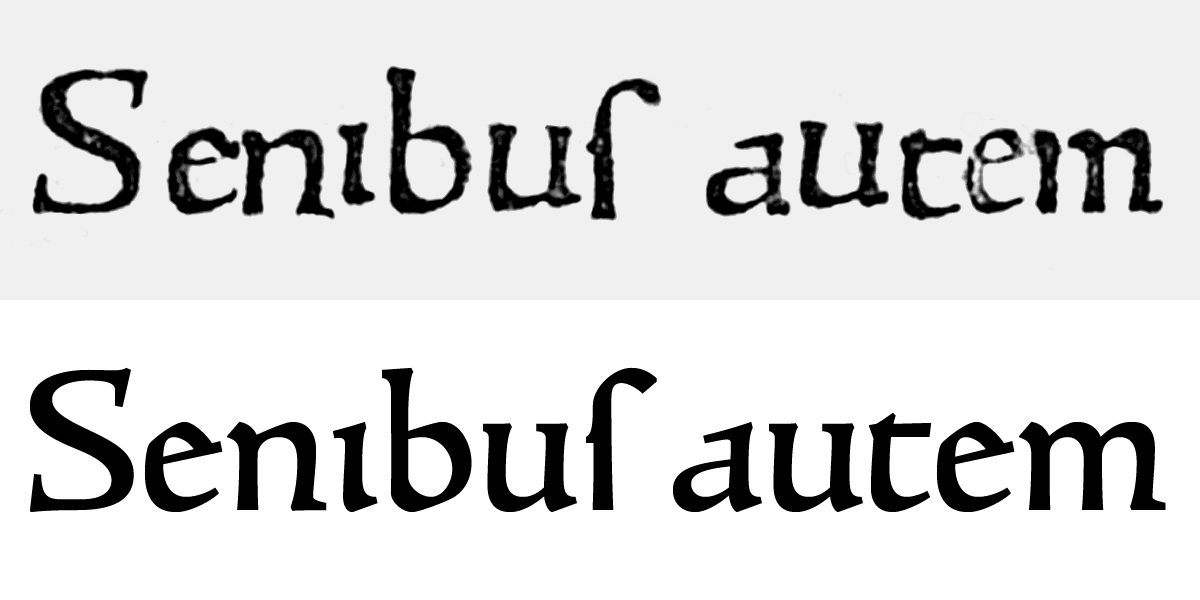
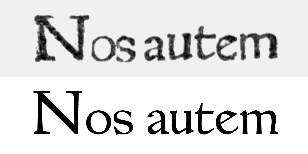
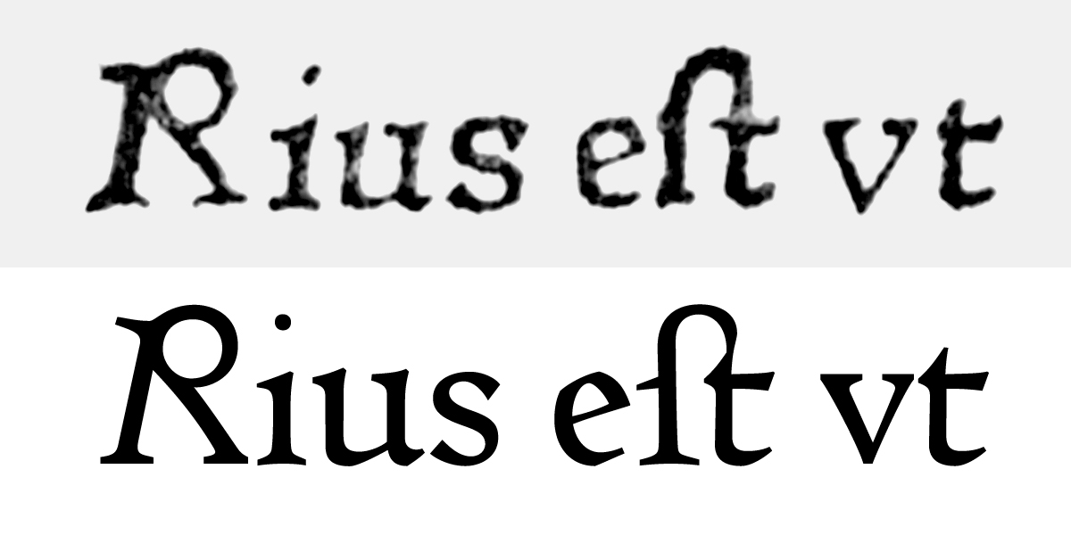
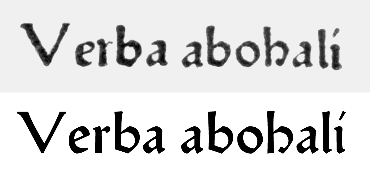
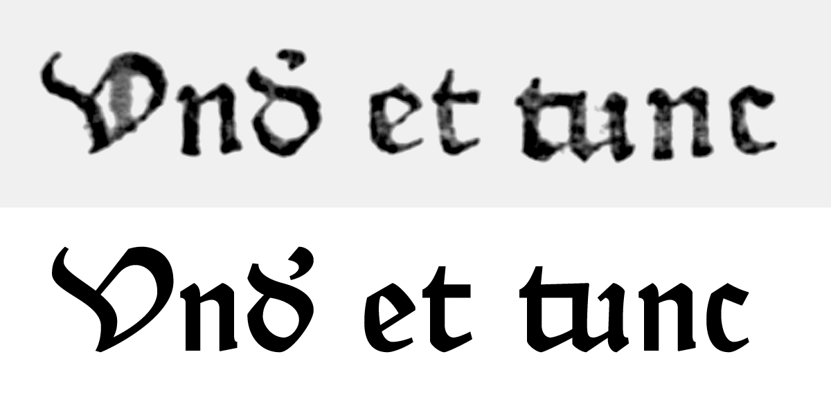
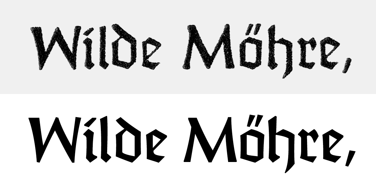
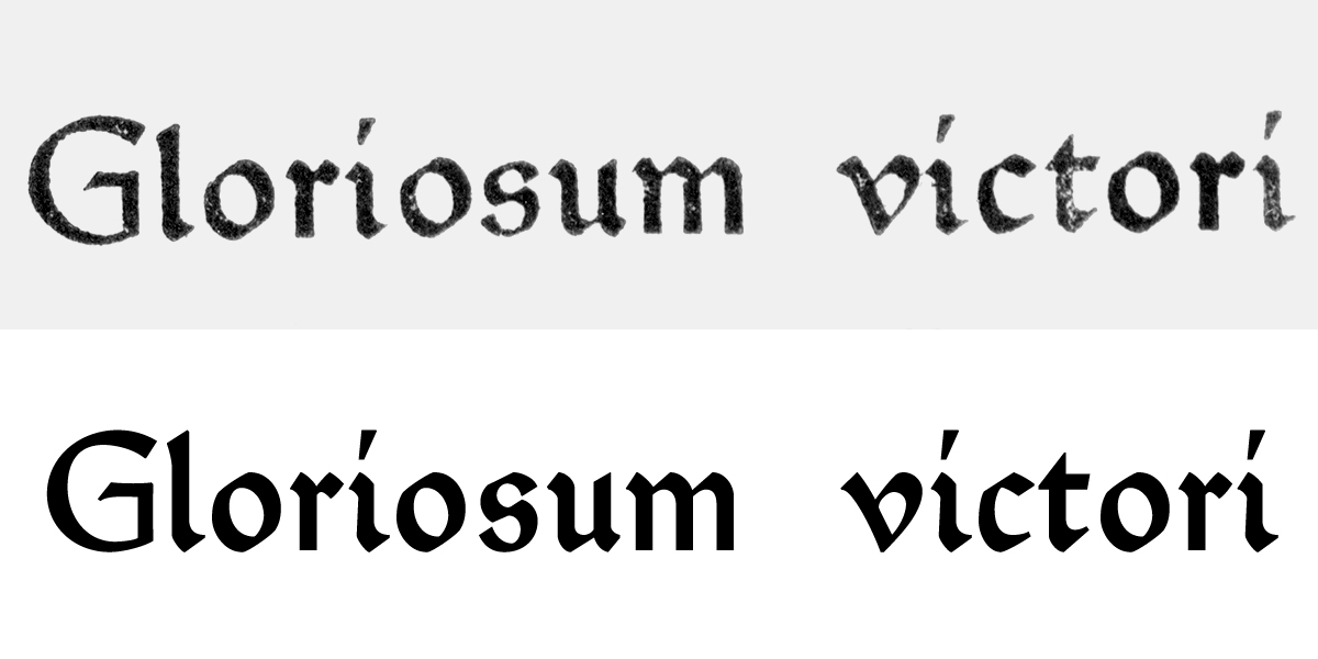
In parallel to historical research, Rafael Ribas & Alexis Faudot, current researchers at ANRT, produced fifteen fonts and one set of initial letters. Based on a series of workshop sessions conducted between 2015 and 2018 in art & design schools across France and Germany, with over 150 students, the digital typefaces are the result of a thorough analysis and redesign of the originals. The typefaces are published as a set of Open Source fonts. Available for download on this website, the fonts are usable for commercial use and modification of the files is allowed under the same licence.

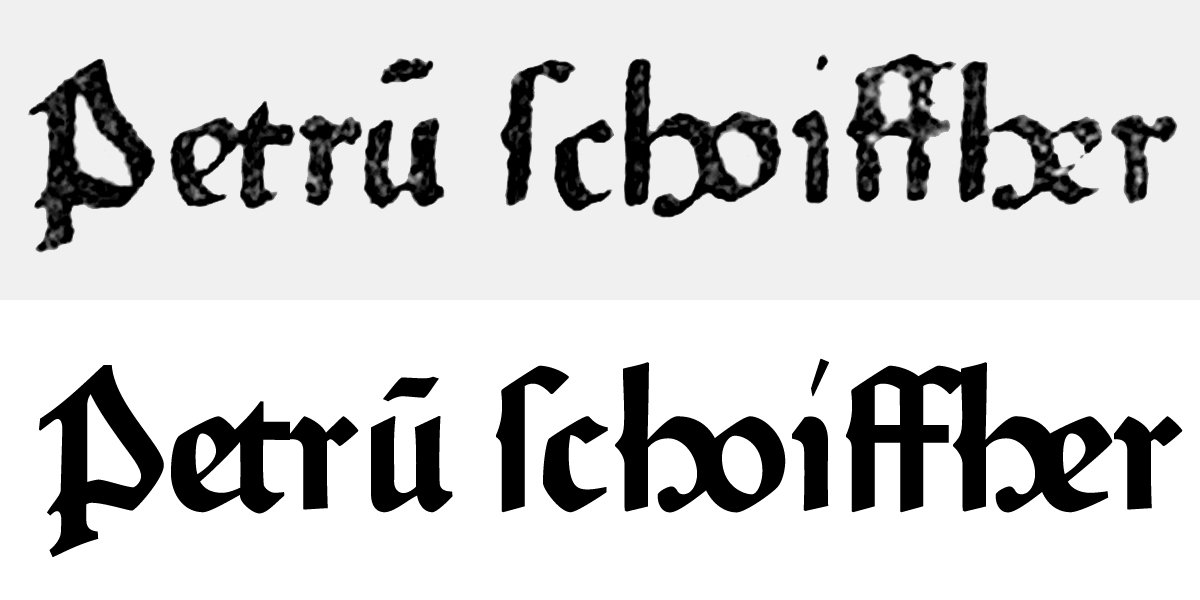
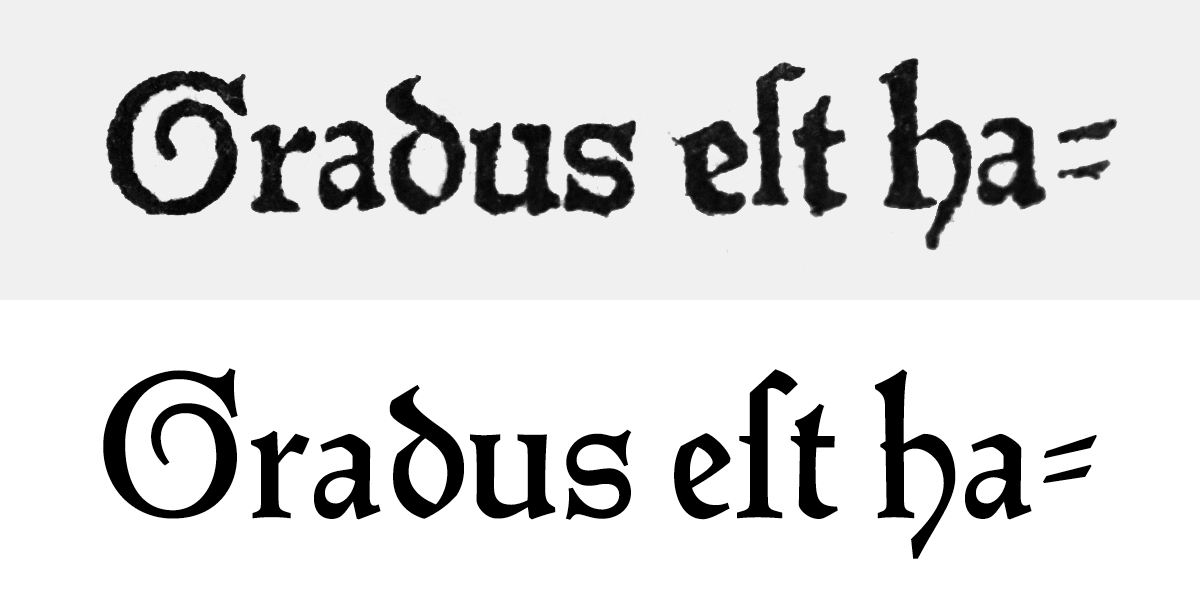
Fust & Schöffer ‘Durandus’ 118G, Gotico-Antiqua first used in Mainz by Peter Schöffer & Johann Fust for Guillaume Durand’s Rationale Divinorum Officorum in 1459. The book displays two sizes, the smaller 92G for the main text and the bigger and more contrasted 118G used only for the colophon and later for the famous 48-line Bible in 1462. Used until the end of the century. Type design workshop at Hochschule Mainz and Gutenberg-Bibliothek, Mainz, June 2016.

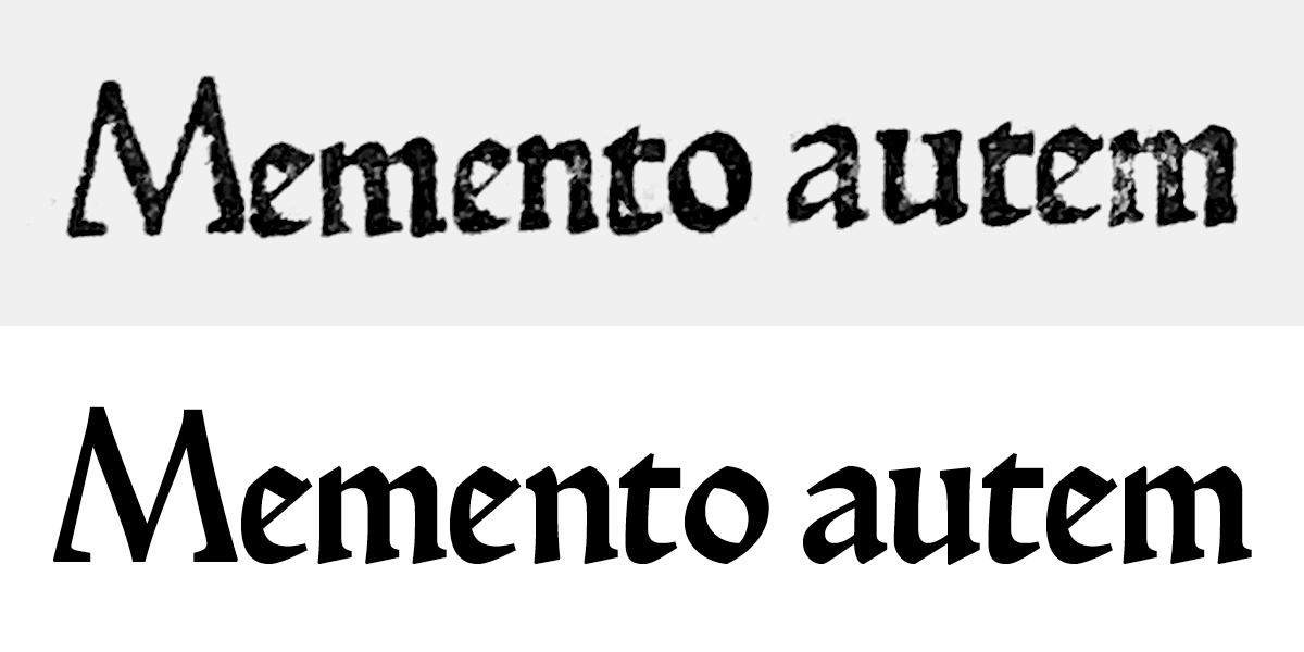
Sweynheim & Pannartz ‘Subiaco’ 120R, Proto-Roman first used in Subiaco by Konrad Sweynheim & Arnold Pannartz, for an edition of Donatus in 1465 (no longer preserved) and used until 1467 in four editions in total. Type design workshop with students of ANRT at Biblioteca Statale del Monumento Nazionale di Santa Scolastica, Subiaco, May 2018.

Sweynheim & Pannartz 115R, Proto-Roman first used in Rome by Konrad Sweynheim & Arnold Pannartz, for Cicero’s Epistolae ad familiares in 1467 and used until 1476. Type design workshop with students of the ANRT at Biblioteca Statale del Monumento Nazionale di Santa Scolastica, Subiaco, May 2018.

Spira 110R, Proto-Roman first used in Venice by Johannes and Vindelinus de Spira for Cicero’s Epistolae ad familiares in 1469 and used until 1473 by Vindelinus. Type design workshop at ENSBA Lyon and Bibliothèque municipale de Lyon, March 2017.

Rot 102R, Proto-Roman first used in Rome by Adam Rot for Dominicus de Sancto Geminiano’s Lecturae super secunda parte sexti Decretalium in 1471 and used until 1474. Type design workshop at HBK Saar and Bibliothèque municipale de Metz, Sarrebrücken, December 2016.

Rusch ‘R-Bizarre’ 103R, Proto-Roman first used in Strasbourg by Adolf Rusch for Raban Maur’s De universo between 1467-74 (exact date unknown) and used until 1475. Type design workshop at ESAL Metz and Bibliothèque municipale de Metz, April 2018.

Rusch 100G, Gotico-Antiqua first used in Strasbourg by Adolf Rusch for Balbus’ Catholicon, between 1470-75 (exact date unknown) and used until 1478. Type design workshop at ESAL Metz and Bibliothèque municipale de Metz, April 2018.

Soufflet Vert 106R, Hybrid first used in Paris by the Au Soufflet Vert workshop for Guido de Monte Rochen’s Manipulus curatorum, 1476 and used until 1480. Type design workshop at ISBA Besançon and Bibliothèque d’étude et de conservation de Besançon, May 2018.

Parix 111R, Hybrid first used in Toulouse by Johann Parix for Rodericus Zamorensis’ Speculum vitae humanae, around 1475 (exact date unknown) and used until 1481. Type design workshop at isdaT Toulouse and Bibliothèque municipale de Toulouse, February 2018.

Zainer 96G, Gotico-Antiqua first used in Ulm by Johann Zainer for Jacques de Voragine’s Legenda aurea not after 1477 and used until 1485. Type design workshop at Hochschule Aachen and Stadtbibliothek Aachen, October 2017.

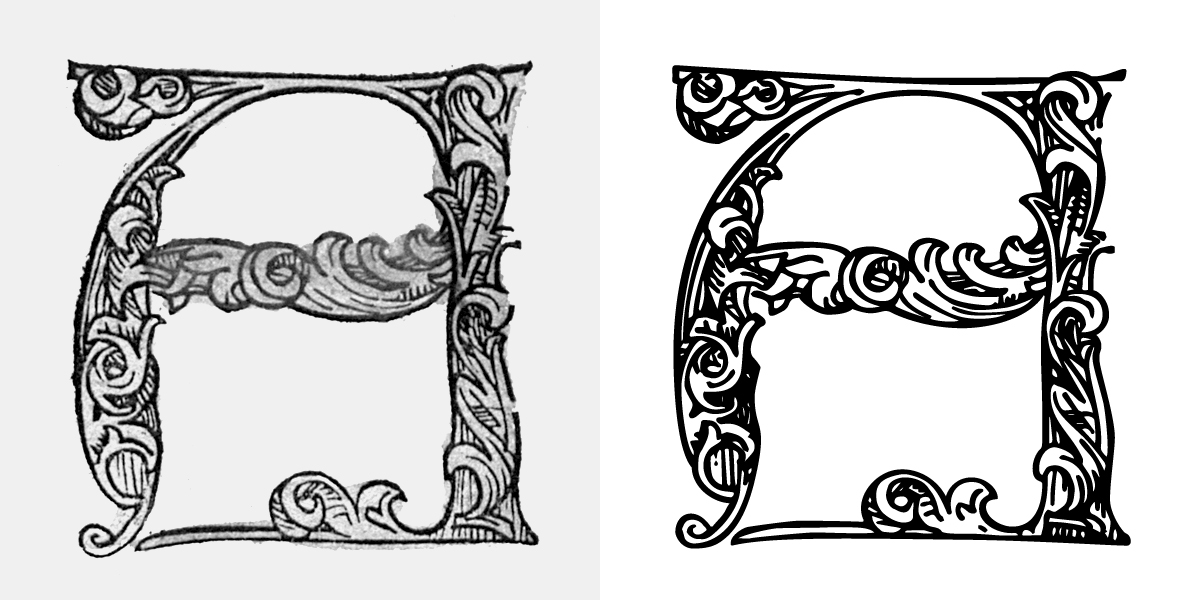
Zainer Initials, richly decorated gothic initials of 45 mm height, first used in Ulm by Johann Zainer for the Spiritual Interpretations of the Life of Jesus Christ around 1478. Used until 1480. Type design workshop at Hochschule Aachen and Stadtbibliothek Aachen, October 2017.

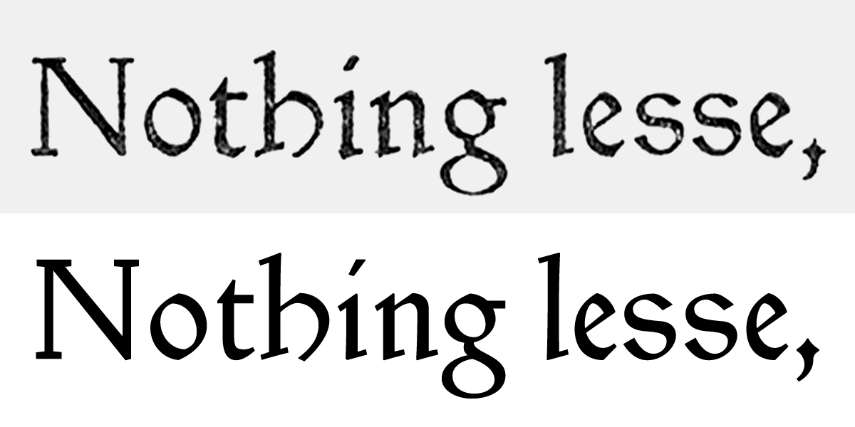
Ptolemy, designed in Chelsea by St John Hornby, Sidney Cockerell and Emery Walker, cut in 18 pt by Edward Prince for Cervantes’ Don Quixote. Published by the Ashendene Press in 1927. The type used until 1935 is a revival of Lienhart Holl’s cut for Ptolemaeus’ Cosmographia printed in 1482 in Ulm. Type design workshop at HEAR Mulhouse, March 2015.

Jessen, hybrid of gothic minuscules and roman capitals designed and cut without preliminary drawings in Offenbach am Main by Rudolf Koch for The Four Gospels. Printed at the Klingspor press in 1926 and published by Koch himself. Formerly named Bibel-Gotisch, the type was released as Jessen in several sizes by the Klingspor foundry in 1930. Type design workshop at ESAD •Valence, April 2016.

Hamlet (also named Kessler-Blackletter), designed by Edward Johnston, cut in three sizes (10, 12 and 18 pt) by Edward Prince for William Shakespeare’s Hamlet. Published by Harry Kessler’s Cranach Press in Weimar in 1929. The type is based on the Durandus for the lowercases, and Sweynheim & Pannartz’ Subiaco type for the capitals. The type was used for trials in other books, none of which were completed. Type design workshop at Bauhaus Universität Weimar and Anna Amalia Bibliothek Weimar, January 2018.
